Modern Minimalism In Middle Park
This Middle Park period home has had a sleek expansive modern extension out the back. It’s a family home that provides wide open spaces for everyone to come together, and cosy rooms with high ceilings in the bedrooms. Function and space maximisation were vital elements of the building design, completed by Todd Pearce of TCP & Co, which we then enhanced with carefully structured "invisible" light.
The open plan living and kitchen area is illuminated with slender linear LED that has been painstakingly recessed into the plaster ceiling, and also installed in the curtain pelmets and fire place nook. This lighting approach is really stylised to match the space, and the resulting light it exactly where it's needed, without detracting from the architecture of the room.
The pelmet lighting bridges the divide between inside and outside and fills the living space with an ambient glow in the evening. Strategically located linear light over kitchen benches and dining areas meet the clients desire to have the right light, without visible or decorative light fittings.
We lit this bedroom with wall lights and table lamps, throwing light up onto the high ceiling to increase the sense of space within. To ensure that you can see into the wardrobe, we installed a recessed strip of LED linear light that is activated by a mechanical switch in the door - turning on whenever it's needed. Fridge lights for wardrobes - it's really worth considering.
The master bedroom walk in robe required a different approach from your usual wardrobe. No doors meant that we could have the lighting doing double duty - specifically illuminating the hanging clothes to make it easier to select them - and also spilling into the room and lighting the entire space. Small diffuse spotlights push light into the centre of the room for checking an outfit in the full wall size mirror and the skylight ensures lights are only needed in after dark.
Image courtesy of Todd Pearce of TCP & Co
Image courtesy of Todd Pearce of TCP & Co
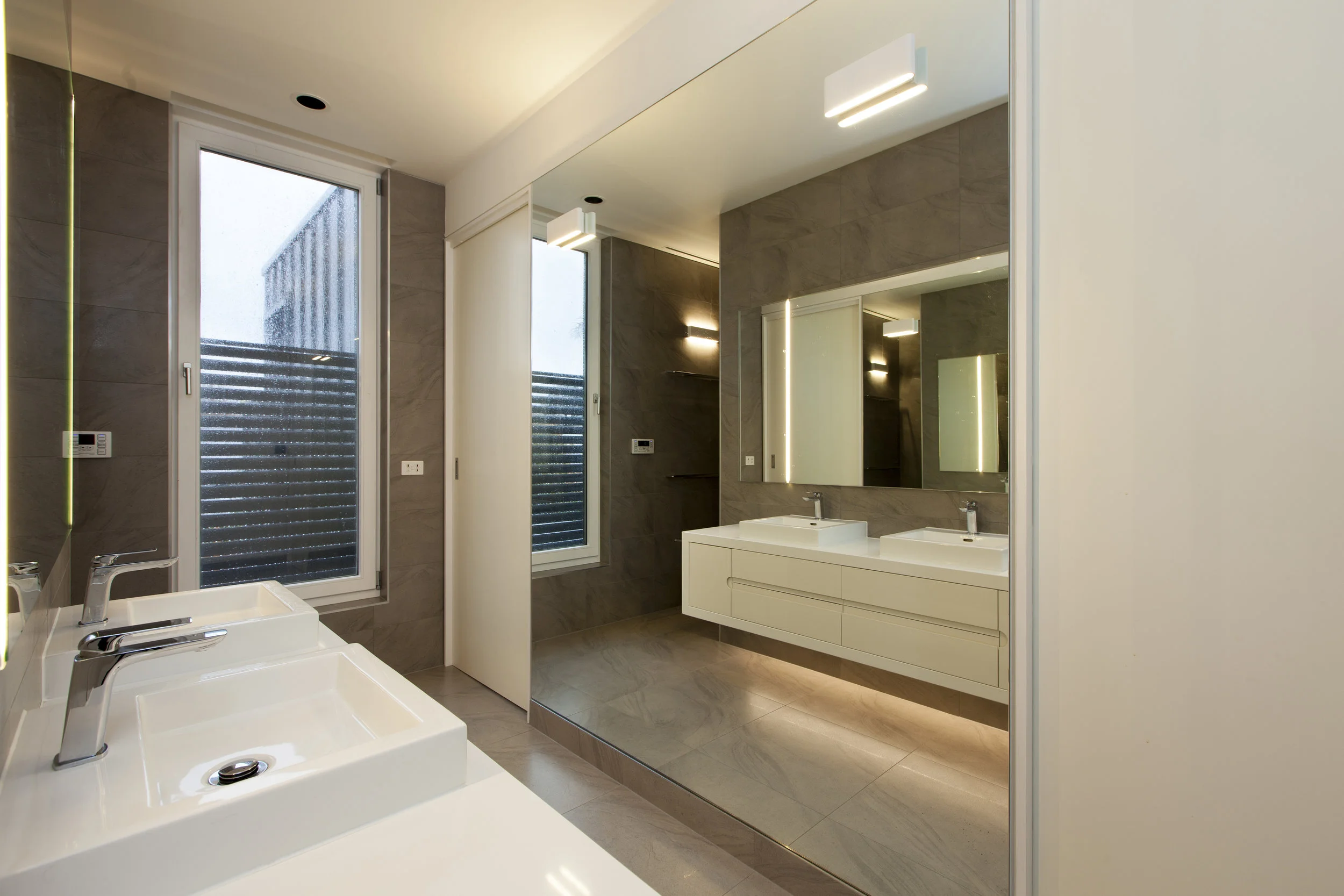
The Master Ensuite is a decadent bathroom, that is lit indirectly avoiding shadows and creating a real 5 star resort experience. Floating vanity is under-lit and wall lights fill the room with a gentle, warm ambient light. To take care of the real light needed at the mirror, super slim linear LED lights with a specially designed diffuser were slotted into the mirror, providing perfect lighting for your face, without any glare or intrusion on the space.
Image courtesy of Todd Pearce of TCP & Co
The master bedroom is subtly lit - with bedside lamps doing most of the work and discreet pelmet lighting adding a spark of joy and sense of daylight especially in the dark winter months. A spacious room, lit for it's single purpose - rest and relaxation at the end of a long day.
The roof-top courtyard is a real secret garden in this home, and it was vital that the lighting not intrude on the experience of the sunset and the night sky from this spot. By keeping the light down low, we make sure it's always comfortable and safe, without affecting night vision. We made a special feature of the original chimney's by wrapping them in water proof light that turns them into beacons of light on the roof, and also provide some ambient light on the deck.
The challenge of installing linear light into timber balustrades was well worth it for this delightful effect that marks the transition from the family home to the parents retreat and master suite upstairs.
The exterior BBQ zone is an extension of the kitchen itself, so lighting needed to maintain the linear style and minmal visual intrusion. The lights themselves are tiny, with the bold effect, which also provides useful light for evening BBQs transforming this space for family and friends. The pelmet lighting also bleeds through the windows, minimising the "black window" effect at night and integrating the outdoors with the living area.
Finally, this tiny powder room packs a real punch with quality finishes and beautiful craftsmanship from builder Mike Lees (whose work throughout the home is detailed and of the highest quality). Hiding the light behind the mirror allows this to be a bright and inviting space with absolutely no glare, creating a quality hotel experience for visitors to the home.
We had a wonderful time collaborating with the design and build team on this project, and it is a perfect example of how to light a home, for a very reasonable budget - without resorting to downlights.
We would like to thank both Todd Pearce from TCP&Co and Mike Lees from Michael Lees Homes for the photographs.


